Responsive Tables in Jekyll

How to use fully responsive Tables in Jekyll using a JustBoil Bulma extension
Published on February 12, 2023 by Marcus Rickert
Jekyll Bulma How-To
2 min READ
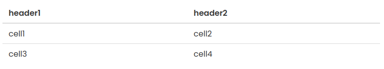
CSS libraries such as Bulma or Bootstrap provide excellent support for making tables on web pages more responsive to the available width. However, as a rule there is a “natural” limit to making the table narrower and narrower which is given by the sum width of the longest words of each column. If this still exceeds the width of the device, the only alternative is to convert the table in a stack of cards where each table row is presented by a card as shown in the following example.
This simple table
will automatically be turned into this stack of cards
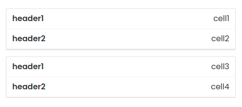
on mobile devices.
For pages coded in HTML this is achieved in Bulma by using the extension
Responsive Tables, adding wrapper <div> tags to each table and
adding a data-label attribute to each <td> tag as shown the following snippet
<div class="container">
  <div class="b-table">
    <div class="table-wrapper
                has-mobile-cards">
      <table class="table">
        <thead>
          <tr>
            <th>head1</th>
            <th>head2</th>
          </tr>
        </thead>
        <tbody>
          <tr>
            <td data-label="head1">
                cell1
            </td>
            <td data-label="head2">
                cell2
            </td>
          </tr>
          <tr>
            <td data-label="head1">
                cell3
            </td>
            <td data-label="head2">
                cell4
            </td>
          </tr>
        </tbody>
      </table>
    </div>
  </div>
</div>
In case of pages coded in Markdown the issue is a little more complicated. Usually, there is very little influence on how the HTML tags are generated for a table in Markdown syntax. Jekyll uses Kramdown for this purpose which currently does not have support for responsive tables.
In my fork of Kramdown I modified the HTML converter to allow for optional generation of the additional tags.
Installation
Clone the repository and build the gem by executing rake dev:gem.
Install the gem by executing gem install kramdown-2.4.0.gem.
In your Jekyll _config.yml file, activate the extension by adding
kramdown:
  bulma_responsive_tables: true
at the top level. If everything works, you will find the enhanced HTML files in the output folder unter _site. Verify
that you see the <div></div> wrappers and the data-label attributes.
The following table is coded in Markdown
| head1 | head2
|-------|-------|
| cell1 | cell2
| cell3 | cell4
and should yield the same layout as in the example above, just in this case it’s responsive, so the layout should adapt to the width. Try it out by making your window narrower on your desktop.
| head1 | head2 |
|---|---|
| cell1 | cell2 |
| cell3 | cell4 |
Have fun!